

Why Tables are a Game-Changer in Power BI! 📊✨
Mastering Power BI Tables: How to Create, Format, and Optimize Your Data for Better Insights

Hey there! Let’s talk about something you probably come across all the time in Power BI—tables! Yep, those trusty grids of rows and columns that help you slice and dice your data. But tables are more than just boring blocks of text and numbers; they can be powerful tools if used correctly. And I’m here to show you why they’re a must-have in your Power BI reports.

When Should You Use a Table? 🤔
You might be wondering, “Why not just use a fancy chart?” Great question! Tables work best when:
You’ve got tons of data to display.
You need to show exact numbers rather than a visual representation.
You want to compare multiple categories across different metrics.
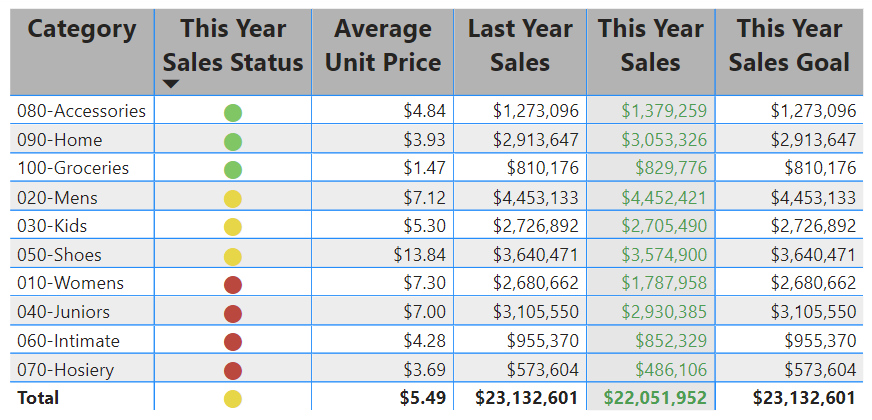
For example, say you’re analyzing sales data across multiple regions. A table lets you compare each region’s sales goals, actual sales, and even calculate the difference between them. With one quick look, you'll know exactly how each region is performing.
Setting Up a Table in Power BI: Easy as Pie! 🥧
Creating a table in Power BI is a breeze, trust me! Here’s a step-by-step guide to get you going:
Open Power BI Desktop.
On the Data Pane, select the fields you want to include.
Voila! Power BI creates a table for you automatically! 🎉
From here, you can get fancy with it. Add more fields, rearrange columns, and format the data to fit your needs. It’s like building a custom report but without the headaches.
Formatting Magic: Make Your Tables Pop 🎨
Okay, now that you’ve got your table, let’s talk about formatting. After all, nobody wants to look at a boring grid, right? Power BI lets you tweak everything:
Change column headers to bold text.
Use conditional formatting to highlight important values.
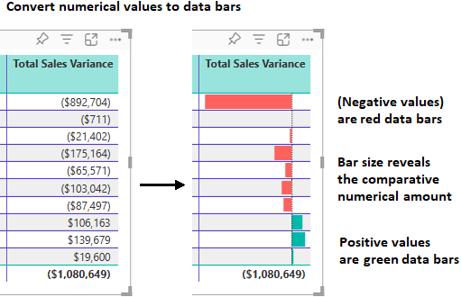
Add data bars to visually represent numbers, like a mini-bar chart within your table!
For instance, if you want to emphasize sales numbers, why not color-code the top-performing regions in green and the lower-performing ones in red? Your brain can pick up on the trends faster without squinting at the numbers.
Conditional Formatting: The Real MVP 🙌
This feature can transform how you analyze your data. Let’s say you’re tracking customer satisfaction scores, and you want to know at a glance which scores are falling below target. Using conditional formatting, Power BI will color those cells red, so you don’t have to go searching for them. Simple, yet effective.
Plus, you can add icons (🔴🟡🟢) next to the numbers to represent different performance levels. Like traffic lights, but cooler. 😉
Copy and Paste Like a Pro 🖱️
Ever built an amazing table in Power BI and thought, "I wish I could use this in Excel or another app"? Well, guess what—you totally can! Just right-click on any cell or group of cells, hit Copy, and you’re good to go. You can now paste those values into other apps like Excel, Word, or even another Power BI report. 🚀
Common Pitfalls and How to Avoid Them ⚠️
One of the most common issues I see is text wrapping. Sometimes, your column headers get cut off, making the table look messy. To fix this, simply adjust the column width by dragging the edges or enabling the Text Wrap option under the formatting pane.
Also, beware of column alignment. Text and numbers don’t always align the way you want, but you can easily adjust this by selecting the alignment option that best suits your table.
Bringing It All Together 🎯
Tables in Power BI may seem basic, but they pack a punch when used strategically. Whether you’re displaying sales figures, tracking performance, or comparing multiple categories, tables give you the clarity you need to make informed decisions. Plus, with all the customization options, your tables can be as stylish as they are functional.
So, the next time you build a Power BI report, don’t overlook the humble table. Dress it up with some formatting magic, and you’ll have a data visualization tool that’s as powerful as any chart or graph.
Go ahead—dive into tables, and make your Power BI reports pop! ✨