Mastering Tables & Matrices in Power BI: What You Need to Know
Power BI Tables vs. Matrices: A Beginner's Guide to Advanced Data Analysis
Hey there! 👋 If you're exploring Power BI, you’ve likely bumped into tables and matrices. They might seem like close cousins at first, but they’re designed for different purposes. Don’t worry—I’m here to break it down in the simplest way possible. Let’s dive in!
Tables in Power BI:
Let’s start with tables. Think of tables as your go-to for simple, detailed views. Imagine you have a spreadsheet showing sales transactions. That’s basically what tables are in Power BI—just rows and columns of data.
Rows = Records: Each row is a record, like a single sale.
Columns = Fields: The columns are details like product name, date, salesperson, etc.
No Aggregation: Tables don’t summarize data. So, if John sells the same product 5 times, you'll see 5 separate rows.
Totals Made Simple: Want to know total sales? Just add a total row, and it’ll sum everything up for you—quick and clean.
Think of tables as "here's all the raw data," and sometimes that’s exactly what you need!
Matrices in Power BI:
Now, matrices are like tables that have leveled up. If you’ve ever used Excel’s pivot tables, you’re in familiar territory here.
Multi-Dimensional Magic: Unlike tables, matrices let you organize data in multiple dimensions. You can break down sales by region (rows) and product category (columns). It’s like taking a data view and turning it into an insightful report.
Hierarchical Fun: Have a dataset with categories? Perfect! You can create a "stepped layout" in matrices. Click on a category to expand and see more details. For instance, start with regions and drill down into individual stores.
Aggregated Data: Matrices automatically sum things up for you. If you're tracking sales, the matrix will calculate totals for you at different levels (e.g., region-wise, product-wise, etc.).
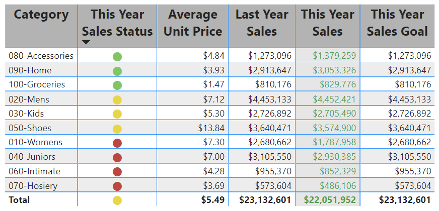
Conditional Formatting: Add some flair! Use colors, icons, or bars to highlight important data points. For example, high sales amounts could be green, low ones could be red.
Real-Time Data Integration: Hook it up to live data sources, and bam! Your matrix updates in real-time, perfect for dashboards.
So, When Do You Use Tables vs. Matrices?
Tables: Best when you need straightforward, row-by-row data. No fancy aggregation, just details. Think of customer service logs or transaction records where every piece of info matters.
Matrices: Go for matrices when you're doing more complex analysis. You want a bird’s-eye view but also the ability to drill down and uncover insights. It’s like peeling back the layers of an onion 🧅 (but in a fun way!). Want to track sales performance across multiple regions and categories? Matrices got your back.
Practical Examples
Tables Example: Imagine you’re working with a sales list. Each row shows the details of every sale—customer name, product, date, and sales amount. It’s perfect when you need to check out individual transactions.
Matrices Example: Picture a matrix showing sales performance across regions. The rows show regions (like North, South), the columns show product categories (like Electronics, Clothing), and the cells? They display sales amounts. Plus, you can expand each region to see which stores performed well.
Key Takeaways
Tables are your simple, no-frills way to show data.
Matrices are all about dynamic, multi-level insights.
Both are important, and mastering when to use each one will make your data analysis so much sharper. 📊
Got Questions?
Feeling good about tables and matrices now? If something still isn’t clear or you want more examples, just shout! 🙌 Happy Power BI-ing! 😄✨


